| By Thomas Piggott, Sr. User Experience Designer, Gale |
Good design practices are as important as ever now that online learning has taken the spotlight during stay-at-home orders and a changing reality for millions of students, educators, and library patrons. Gale is here to help with some best practices for ensuring your library website meets the needs of your community. Read on for our top four tips:
Big and Obvious Calls to Action (CTAs)
The most prevalent approach we’re seeing on library websites right now is placing a can’t-miss banner or other call to action on the home page. The banners direct users to the library’s COVID-19 resources, the best online resources to leverage, or ways for patrons to get in touch.
We like what LA County Library has done with their home page. There’s a clear call for patrons to get their library card—the first step any patron must take to access materials.
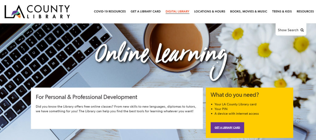
The yellow section with the bright purple button offers strong color contrast and draws attention to the most important action on the page.
Language That Resonates
Our next tip is to use language that resonates with your audience, avoiding jargon or acronyms they may not know. We’ve seen great use of language that matches what students and educators are looking for, with clear and succinct messages like “Learn more about COVID-19” or “Resources on the Coronavirus” for information specifically on the virus. For educators suddenly out of a physical space and into the virtual, keep it simple with messages such as “Moving Instruction Online” or “Resources for Remote Learning.” Indian River State College’s FAQs phrase questions exactly as we imagine students might be asking them.
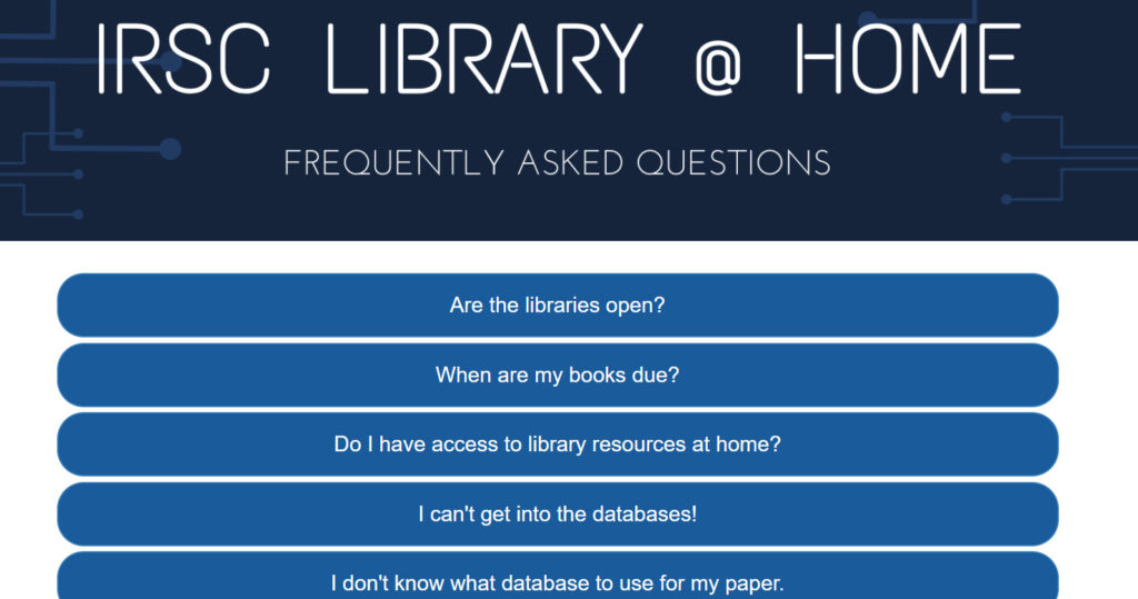
Conversational language, like “I don’t know what database to use for my paper.“, clearly speaks to a problem they know their students have.
New and Updated Pages
We’ve also seen the creation of new pages dedicated to these resources. The pages create a new category and one-stop shop for finding help online. This is valuable to users—without it, they may feel overwhelmed looking for where to go on your website. Be careful not to overload the newly created pages with resources, which may also overwhelm users. Harvard Library’s website nicely illustrates how to provide useful information in simple sections on how to get in touch, the best tools for teaching online, and additional resources.
Beyond the utility of a single hub for this information, creating new pages also shows patrons that the library is actively working to support them with the latest resources. It acknowledges that these are no ordinary times and helps users feel connected.
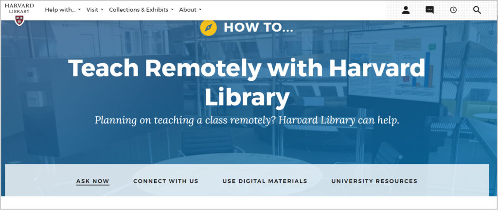
This page is clearly built with the move to remote teaching in mind and offers 4 clear navigation elements below the title to help users get what they need, faster.
Clear Target Audiences
It’s important to recognize that one size doesn’t always fit all. While patrons may start at your new pages, it’s helpful to direct people based on their common needs. We like what San Mateo County Community College District has done by setting up pages targeted at specific audiences.
- Students are directed to a page detailing the tools they’ll need to continue their education online.
- Employees get a page with resources dedicated to how to transition to working from home.
- Faculty can go to a page that provides detailed instructions on the steps they need to take to leverage the school’s resources and teach remotely.
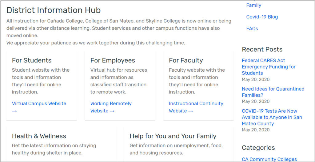
Here, you can see the 3 main audiences and then below, space for additional guides.
Wrap-up
These few simple tips can mean all the difference to your library patrons as they navigate a stressful time. Of course, these tips are meant only as a guide, highlighting some of the best practices we’ve seen. You know your patrons and how to serve your community’s unique needs best.
Don’t forget to test out whatever you come up with by asking for feedback from patrons or putting your designs in front of colleagues. You’ll always be pleasantly surprised with how your pages can improve by incorporating feedback from those trying to use them.
As always, Gale is here to partner with you to help your library succeed in its mission. Learn more at support.gale.com.
M2k Tekno