| By Megan Sullivan, Senior Product Manager |
I’m delighted to share that after several years of research and technical preparation, an updated experience for State Papers Online will be ready to preview on Monday, August 1, 2022. This will be a “soft launch,” meaning that on this date, users will be able to access the beta version of the new State Papers Online from a link that will be available from the current State Papers Online home page. We encourage users to try the new experience and send us their feedback, and we’re also recruiting for paid user interviews and usability testing. We plan to retire the current version of State Papers Online in December 2022, and from that date forward, State Papers Online will be exclusively available in the updated experience.
This beta version was informed by extensive user research, and the goal of this next research phase is to ensure that users have ample time to get acclimated with the new experience and share their feedback—we want the final product to not only meet expectations but exceed them. So far, we’ve made several impactful changes and enhancements that will be available to test in the beta version. This includes:
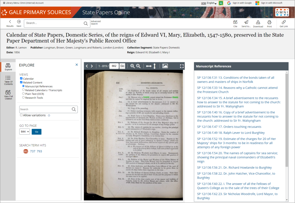
Fully digitized, text-searchable calendars — We have digitized all available calendars, and the facsimiles will be fully searchable and browsable in the new experience as hi-res images. You will continue to be able to search the rekeyed calendar text, in addition to the optical character recognition (OCR) of the new calendar facsimiles.

Improved navigability of manuscripts and calendars — View the manuscript item and calendar entry side by side, jump seamlessly between the manuscript item and the corresponding calendar facsimile, and vice versa; view a full list of items in a manuscript volume from the document view; toggle between item and volume view; and more.
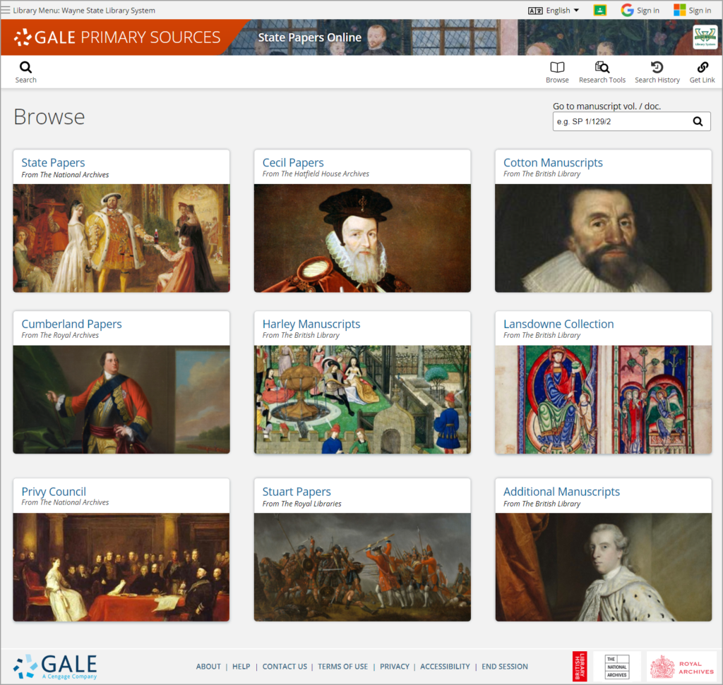
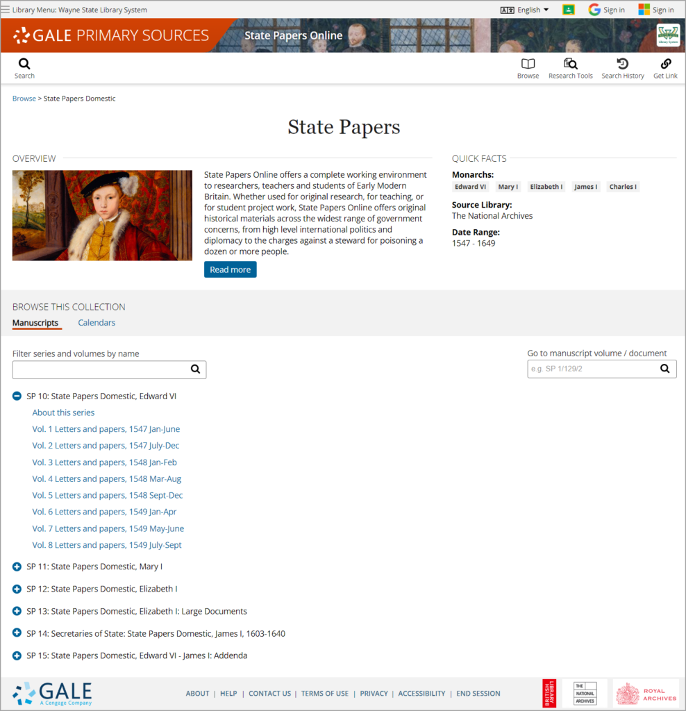
Enhanced browsing experience — Browse available manuscripts and calendars by source library collection in an engaging new interface, and read a detailed overview and quick facts about each collection.

Please note: This is only a prototype. The version users will see in the online archive may be displayed differently.

Please note: This is only a prototype. The version users will see in the online archive may be displayed differently.
Smarter search results — More filtering options in search results; subject expansion, which will look for pseudonyms and synonyms of your keyword; and access to our Topic Finder and Term Frequency textual analysis tools, which analyze the calendar text.
Streamlined user interface — Consistent with other Gale products, this will deliver an engaging experience that allows quick access to search tools; relevant content; and collaborative features, like Google Drive and Microsoft OneDrive.
Improved accessibility — Maintained for web accessibility standards to ensure access by users of all abilities.
Instructional support — A Learning Center will be available in December, which will feature reference content, sample topics, essays by experts, search tips, and more.
I look forward to sharing the beta with you on July 29! If you’re interested in participating in a paid user interview about your experience with the beta version, please contact me at [email protected]. I look forward to hearing from you!
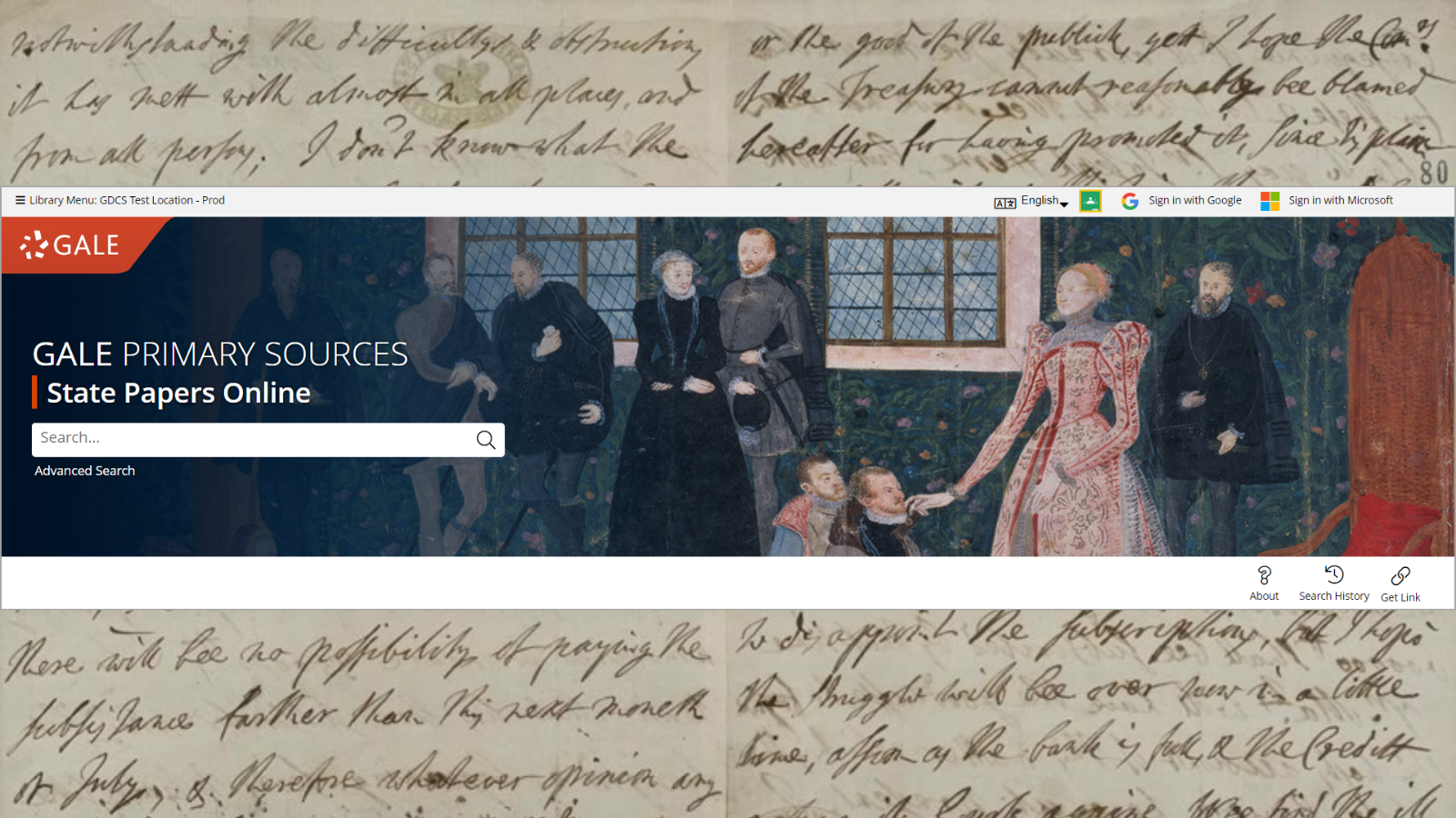
Banner image: This is an image of the home page banner, basic search box, and main toolbar. This is a screenshot of the actual product.


