Have you ever muttered disparagingly about a website or app that doesn’t look or behave the way you expect it to? Does it frustrate you when icons don’t make sense to you, or when you can’t find navigation aids?
We hear you. And that’s why we’ve initiated a whole range of improvements that make a huge difference in user experience in GVRL, InfoTrac, and In Context* resources, including the PowerSearch platform as well as Genealogy Connect, Twayne’s Authors Online and Scribner Writers Online. The enhancements are coming April 2nd.
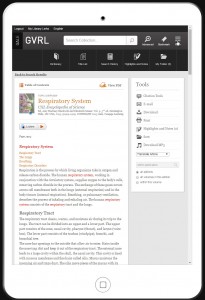
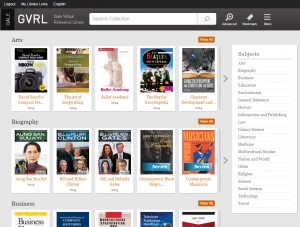
- Accessibility Improvements — Web Content Accessibility Guidelines 2.0 make information available to a wide range of people with disabilities,including those with blindness or low vision. Each resource will adopt a high-contrast header that makes it easier for users to see content. With this stronger separation of background and foreground, accessibility is improved for those listening to the content as well.
- Popular Iconography — Implementation of popular web and app icons, such as the familiar three-bar “More” button, make it easy for users to quickly identify and interpret each tool. Applying these changes across all resources—similar banners, tools, language, and color palettes—delivers a seamless experience as users mature from high school to college-level research, or navigate across resources using discovery services and tools such as PowerSearch or InterLink.
- Improved User Workflow — Through extensive user experience testing and usage reporting, we’ve identified the most popular user tools and accentuated them in the top header. To improve navigation, all other features have been minimized behind the familiar three-bar “More” button/icon. This unclutters interface design and streamlines user workflow.
- Content is King — A simple shift of menus, toolbars, and filters places content consistently in the prime, top-left real estate. This is particularly useful for users on tablets and smartphones as it maximizes the amount of content in view on smaller screen sizes. And with common tool sets, icons, and language across each product, you’ll spend less time instructing users how to find information and more time on how to effectively analyze, interpret, and apply the information.
- Responsive Design — Responsive design is considered the best way to optimize web content for mobile use today. With this enhancement, display of the GVRL, InfoTrac, and In Context resources will automatically be optimized for any screen size on any device—no app required. This brings a better overall experience to both desktop and mobile users—in addition to optimized display of content and features, traditional elements automatically become “swipeable” on touch screen devices. Responsive design also seamlessly delivers high-quality and easy-to-use research tools to schools and students participating in BYOD and 1:1 initiatives.
Here’s how these modifications will improve users’ experience:
- Now librarians and teachers can spend less time working on training materials and
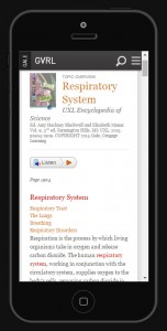
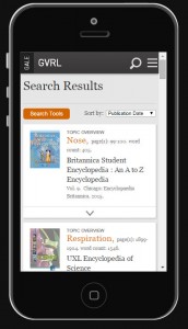
GVRL article view on an iPhone. Click to enlarge. demonstrating user tools, and more time on teaching users how to analyze, interpret, and apply the information.
- These enhancements support student workflow, especially for BYOD/1:1 initiatives in K12 schools. Some 71% of districts surveyed in 2014 have adopted mobile technology — a 60% increase over 2013. 82% are highly interested in implementing or expanding 1:1 mobile access within the next two years.
- People with disabilities, including low vision and blindness, and those with different learning styles will enjoy easier access to authoritative, high-quality resources.
- As libraries develop responsively designed websites, linking to resources that are similarly optimized improves the beginning-to-end user experience and makes a seamless connection between the library and the resources it provides.
- Improved user satisfaction leads to increased usage. According to surveys conducted via Foresee, nearly 70% of all users accessing a Gale resource from a tablet or smartphone said they would be more likely to use the product if it were mobile optimized.
- By unifying user experiences across platforms, Gale will collect user feedback in greater volume, more quickly. We’ll identify patterns and trends early and often…and respond with improvements faster than ever!
These changes will take place automatically on April 2 (no need for you to take any action), so be prepared to be dazzled! Or dazzle yourself today and try the new experience from within your GVRL or In Context products.
*Exception: Global Issues In Contextlegit yeezy site coupon free trial software


The new interface is clean and I’m very happy that Gale-Cengage is using a high-contrast for people with low vision. Thank you for keeping this population in mind. My library has been working to provide better service to people with disabilities. I will mention this upcoming interface change to the low vision group at their March meeting.
Thanks for sharing, Paula! Your library can feel free to repost this blog content to share with your users too.