Creating an Export Workflow Using the Gale Digital Scholar Lab
| By Sarah Ketchley, Digital Humanities Specialist, Gale |
Cover photo from The Illustrated London News
This digital project was prompted by my interest in the reporting of archaeology in The Illustrated London News, a publication notable for its fine illustrations and contributions by some of the preeminent figures of the day. Gale Primary Sources offers access to the entire run of the newspaper, covering the period 1842‒2003. This post describes my workflow for the preliminary investigation of the data: initial content set creation, cleaning, analysis, export, and visualization. At the outset, the research questions were necessarily broad:
- Which words were most prevalent in articles reporting about archaeological digs?
- What themes or topics are most prevalent in the dataset?
- What was the overall feeling about this type of reporting? Was it reported favorably?
- Is it possible to identify which archaeologists were directly contributing to the publication and how many contributions they made?
Engaging in the practical process of curation and analysis offers opportunities to refine these questions, and almost inevitably suggests new avenues for future exploration.
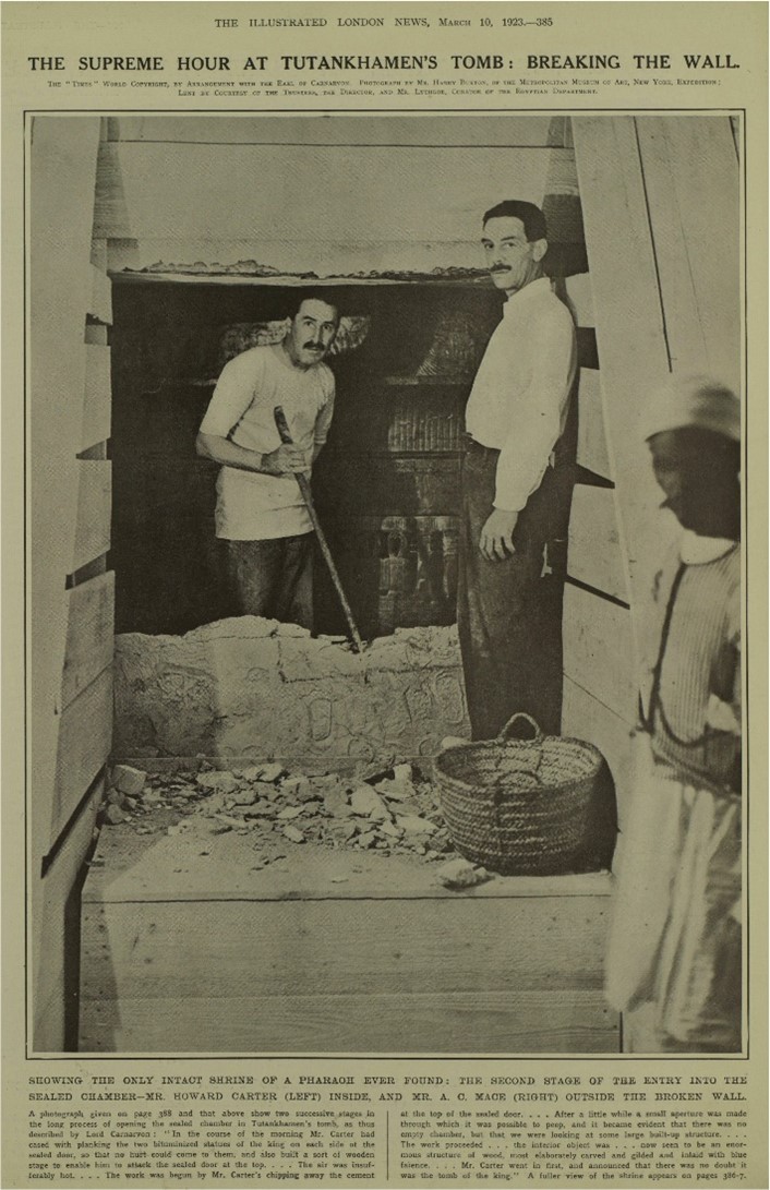 Newberry, Percy E. “The Making of an Archæologist.” Illustrated London News (March 10, 1923): 388. The Illustrated London News Historical Archive, 1842‒2003.
I built my dataset by searching the Gale Primary Sources archive using Advanced Search in the Digital Scholar Lab for keywords, including “archaeology,” which appears for the first time in 1881; “excavations”; and “ruins.” I also searched by site, excavator, and civilization; for example, “Layard,” ”Assyria,” “Nineveh,” “Sumerian,” “Egypt,” “tomb,” etc. While the results weren’t comprehensive, I ended up with an initial content set of 2,513 primary source documents—mostly newspaper articles with some advertisements. This corpus comprised a collection of optical character recognition (OCR) texts generated from original scans of the ILN Historical Archive, accessed via the Digital Scholar Lab and Gale Primary Sources.
I wanted to examine the content of the documents to see if I could identify recurrent themes or topics, along with the most common words and expressions of positive or negative sentiment in the dataset. I opted to work with Tableau to generate multiple visualizations for display on an interactive dashboard. To create the statistical data underlying these visualizations, I used the Digital Scholar Lab to run a series of text-mining analyses with the tools available in the platform using the following workflow:
1. In order to perform statistical analysis on my content set, I needed to clean the texts to remove recurrent OCR errors, and also to remove stop words, which are the most common words in the English language and not of interest for my research. I ran a preliminary nGrams analysis to identify prevalent OCR errors: I configured the tool to return only unigrams (single words), and exported the results as a CSV. I was able to identify and weed out some regularly occurring OCR errors reflected in the CSV, which I pasted into the stop word list in the Clean tool. I continued to iterate on this process, removing and correcting the base OCR texts.
Once I created a clean configuration that removed most of the most common OCR text errors, I ran the collected dataset through my analysis tools.
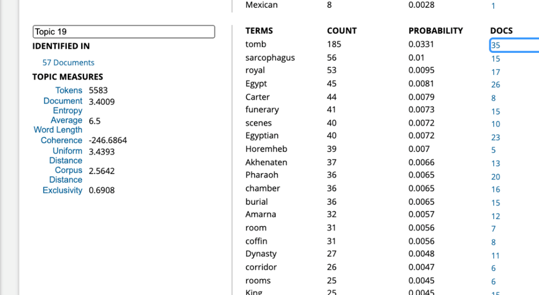
2. Topic Modeling: The Digital Scholar Lab uses a tool called MALLET to perform LDA topic modeling on the corpus of texts. The algorithm iterates through the “bag of words,” or collected textual data, and identifies terms that are topically similar, then groups them together. The configuration I chose to run was 30 topics, each containing 20 topic terms, while also applying the cleaning configuration I’d created. I chose this number of topics because I wanted to move beyond what the algorithm would find most obvious, and instead discern connections that were less apparent in the dataset. I exported the results of this analysis run as a CSV, as well as a second “topic proportion by document” analysis spreadsheet, which I didn’t end up using for this run of visualizations but which nonetheless provides a wealth of granular detail about my documents.

Digital Scholar Lab Topic Modeling CSV Output.
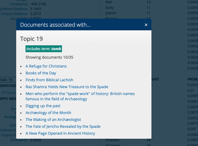
I examined individual articles returned in the results list using the Document Terms output alongside the Documents by Topic pop-up.
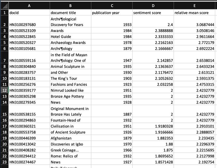
3. Sentiment Analysis: The Digital Scholar Lab visualizes sentiment across time using the AFINN sentiment lexicon, which ranks documents as positive, neutral, or negative on a scale of +5 to -5, based on the words included in the text. I ran this tool on my cleaned dataset and exported the results as a CSV.
I anticipated that visualizing this data would give me a sense of how archaeology and archaeological reporting was presented in a popular publication; ideally, I’d like to compare this with other contemporary newspaper reporting while also taking into account authorship—whether the material was written by an archaeologist or by a staff reporter.
4. Clustering: This analysis is carried out using the k-means clustering algorithm. The documents were grouped in 20 clusters, according to the algorithm’s ranking of proximity or similarity in document content or other factors, and I again downloaded the CSV output.
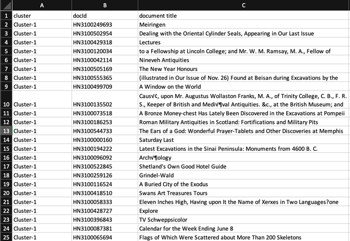
I found this output more challenging to visualize in a meaningful way, and ultimately opted to drop clustering in favor of topic modeling, which provided a thematic breakdown sufficiently detailed to be of interest.
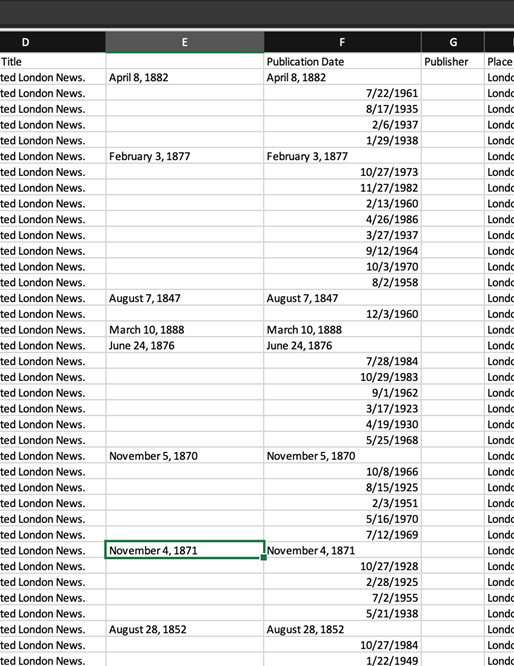
5. Finally, I downloaded the metadata for all the documents, which included author, title, date and place of publication, and document ID. I wanted to see if I could identify whether archaeologists wrote regularly for the newspaper, and the content and context they provided compared with more formal academic publications. This is where the real challenge began!
Working with Dates in Excel
I looked at the date formats and noted that post-1900 dates were written numerically, while pre-1900 were text. This prompted the methodological question of how to clean up these variances, an issue that was compounded by Excel not recognizing dates before January 1, 1900.
I was able to find a couple useful resources online that helped me solve the problem, but I was surprised by how complex it turned out to be.
This article provided good background context. While this post ultimately solved my issue.
I began by manually splitting out the text dates into a separate column.
I then created an additional three columns in order to perform the text-to-number conversion and to get Excel to appropriately render dates before January 1, 1900.
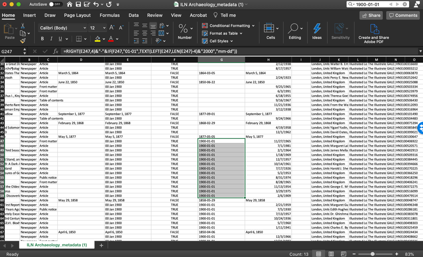
Columns E, F, and G are the added columns, and the final formula is shown in the function bar. One issue that arose was that blank fields were replaced with “1900-01-01,” and trying to clean these up with find and replace didn’t work. Again, I had to do this manually, but the outcome was a table with all dates standardized in the format YYYY-MM-DD.
Using Exported CSV Data in Tableau
Ngrams
To answer the question “Which words were most prevalent in articles reporting about archaeological digs?” I visualized the nGrams CSV output in Tableau. A bar chart proved to be the most effective visualization.
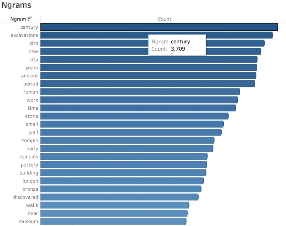
Following data cleanup, the most common terms included “century,” “excavations,” and “site,” which one would probably expect in documents related to archaeology. The first civilization mentioned is “Roman,” and the city is “London,” which, given that the newspaper was published in the UK and Roman archaeological artifacts are regularly found, wasn’t surprising. Further refinements in the terms may yield interesting results about the civilizations most commonly reported on and whether the focus was on the material culture or the process of archaeology itself.
Topic Modeling
I used a circle view in Tableau to visualize my topic modeling analysis to answer the question “What themes or topics are most prevalent in the dataset?” I found the option to display all or to zoom in on a single theme to be most helpful.

Topic modeling is a qualitative analysis, so it’s incumbent on the researcher to decide what the connections are between the terms the algorithm comes up with and to then name the topic appropriately. In this case, the most common words are grouped around the theme that I named “excavations and finds.” The term displayed above is “site,” which occurs 2,323 times in the dataset.
I plan to do more work on this visualization, returning to the Digital Scholar Lab in conjunction with Tableau to experiment with various topic measures available in the platform. The granularity of this data could allow for more detailed analysis results as I continue to refine the OCR content.
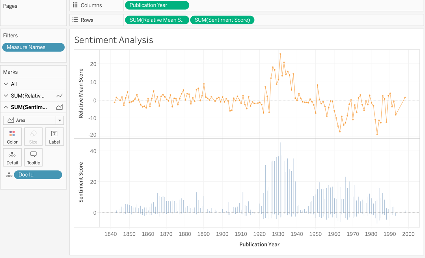
Sentiment Analysis
I used the sentiment analysis output to answer the questions “What was the overall feeling about this type of reporting?” and “Was it reported favorably?” I imported the CSV and created a sentiment analysis visualization in Tableau using two line charts to show the relative mean sentiment score and the sentiment score. The data was visualized over time, between 1842 and 2003, the full run of the newspaper. On the whole, the sentiment is overwhelmingly positive.
Selecting the most positive report brings up the detail of the point, along with the relevant Gale Doc ID.
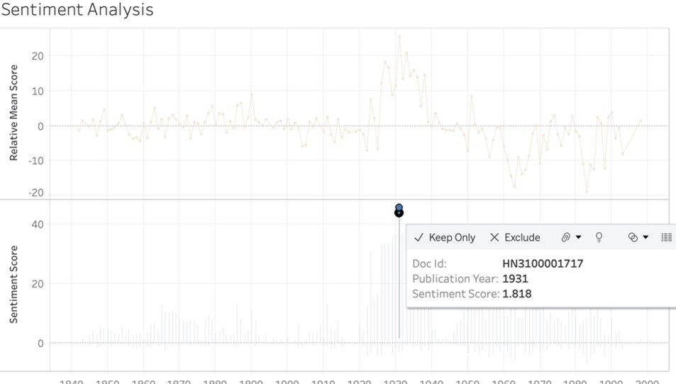
I was then able to go into the Digital Scholar Lab to find the document and figure out what made it so positive.

Words like “genius,” “unique,” “important,” and “finer” contributed to the positivity of the document. Looking at the period between the world wars, there was a lot of positive reporting on archaeology, and it was a time of great activity and discovery. This visualization did a nice job of capturing the spirit of discovery, while the two line charts gave a good sense of the pervading sentiment in the newspaper.
5. My final question pertained to the archaeologists themselves: “Is it possible to identify which archaeologists were directly contributing to the publication and how many contributions they made?”
The answer is yes, but interestingly, fewer of the articles prior to 1900 have an author’s name associated with them. I didn’t realize that the articles started having bylines after this date until I looked at this visualization. There are a number of well-known archaeologists authoring articles, including Max Mallowan, who excavated in Iraq and was the second husband of Agatha Christie; Howard Carter/Percy Newberry/Harry Burton/A. Mace (Tutankhamun); Henry Frankfort (early Egypt); J. D. S. Pendlebury (Egypt and Crete); John Garstang (Egypt); and many more. It was fascinating to see how many archaeologists wrote articles for the publication. I plan to compare authorship of similar articles from other contemporary newspapers—for instance, The Times of London—to see if the ILN is an anomaly or the norm.
Tableau Dashboard
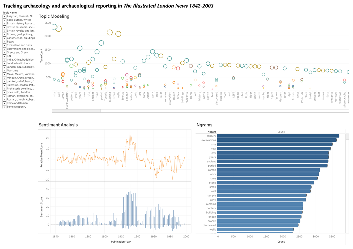
My final Tableau dashboard included the Ngrams, sentiment analysis, and topic modeling analyses generated by the raw exported data. Ngrams showed that while the general terms “century,” “excavation,” and “site” were the most common in my dataset, the most-reported excavations were those with Roman finds. This pattern was reinforced when interacting with the topic model: again, the biggest topics included those describing general archaeological terms, while the algorithm also did a good job of grouping by civilization or type of find, including Egyptian, Assyrian, Roman, Greek, Etruscan, and pottery, bronze/metal, tomb, etc., and giving a snapshot of some of the more significant archaeological activities of the day. Finally, sentiment analysis indicated that the period between the two World Wars was most positive in nature: there were are a large number of excavations underway during this period with well-reported finds. While I didn’t include my analysis of authors in the final dashboard, I was able to identify the main contributors to the newspaper, who also happened to be some of the more famous practicing archaeologists of the day. This opened a new research angle to me, as I thought about comparing published excavation reports by these individuals and their more popular writing.
Meet the Author
Sarah Ketchley is an Egyptologist and art history scholar in the Department of Near Eastern Languages & Civilization at the University of Washington, where she teaches introductory and graduate-level classes in digital humanities, and directs a student DH internship program. She is a Digital Humanities Specialist at Gale, supporting librarians, faculty and graduate students as they use the Gale Digital Scholar Lab for research and pedagogy.