A new tool has been added to Analytics On Demand. It’s called the dashboard.
What is the Dashboard?
The Analytics On Demand dashboard gives users the ability to transform patron data and drill down into rich visuals. Best of all, once the three apps needed for the dashboard output are acquired by the library, it’s no additional cost.
The Analytics On Demand dashboard is made available through Microsoft Power BI and Tableau Reader. Both tools offer much of the same features and functionally giving users the ability to choose which output best serves their library’s needs.
Below are just a few examples of what you can expect:
- Data you can dig into – leveraging insights from your Marketing Action (Patron & Non-patrons) and Patron Profiles apps, the dashboard allows interactive visualization of your data. Create your dashboard output once, and view it anytime, anywhere.
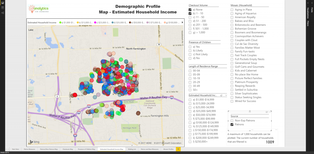
- Data you can manipulate – once your patron data is uploaded to the dashboard, you can drill down into its visuals; move maps indicating patron households, target certain demographics, and download custom mailing lists based on your selections.
- Data you can share – simply save your dashboard output and send to your colleagues. As long as they download the free applications provided by Microsoft and Tableau, everyone can benefit from the report data and dashboard interactively.
Inside the Dashboard (Power BI)
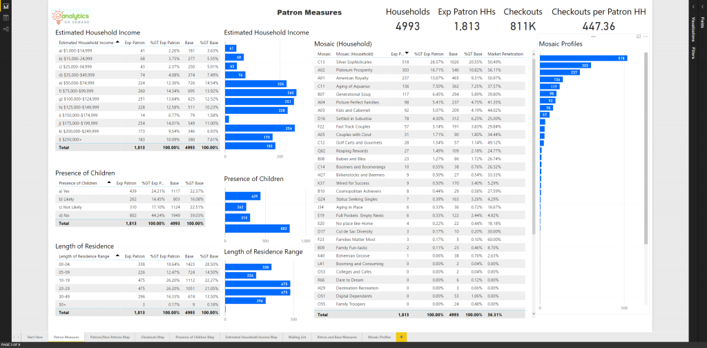
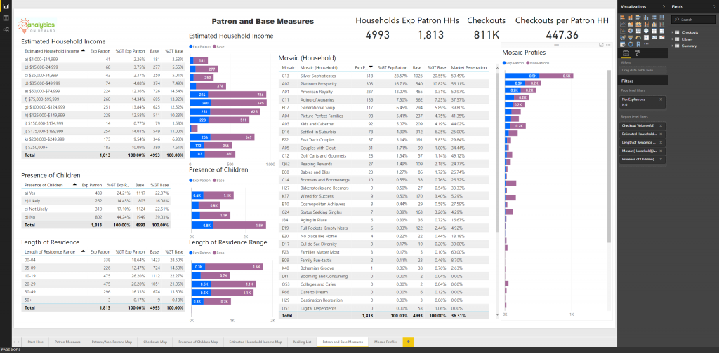
Take a look at the Patron Measures to discover exactly who’s in your community. Clicking on any bar chart manipulates the data that fills the remaining data fields.
Curious who your power users are? With the dashboard, you’re only a few clicks away. You’re also only a few clicks away from uncovering library card-holders with limited engagement.
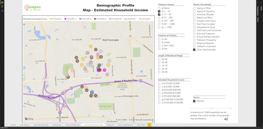
Maybe you know that the most prevalent Mosaic lifestyle segment in your community is “Silver Sophisticates”. But, who in that segment might need a little push to get back into the library? Find them with Analytics On Demand, export the list of households, and send a targeted campaign to get them back in the library!
The Patron and Base Measures output allows you to visualize your library community in relationship to your community’s net household population. Utilize your outreach funds to households that will get you the best ROI.
Inside the Dashboard (Tableau Reader)
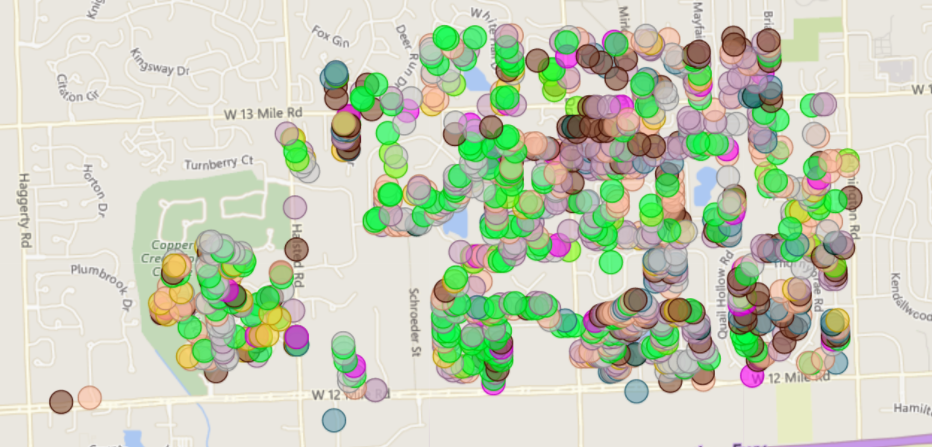
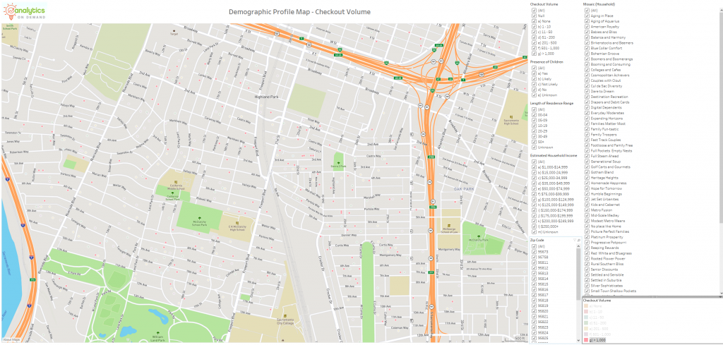
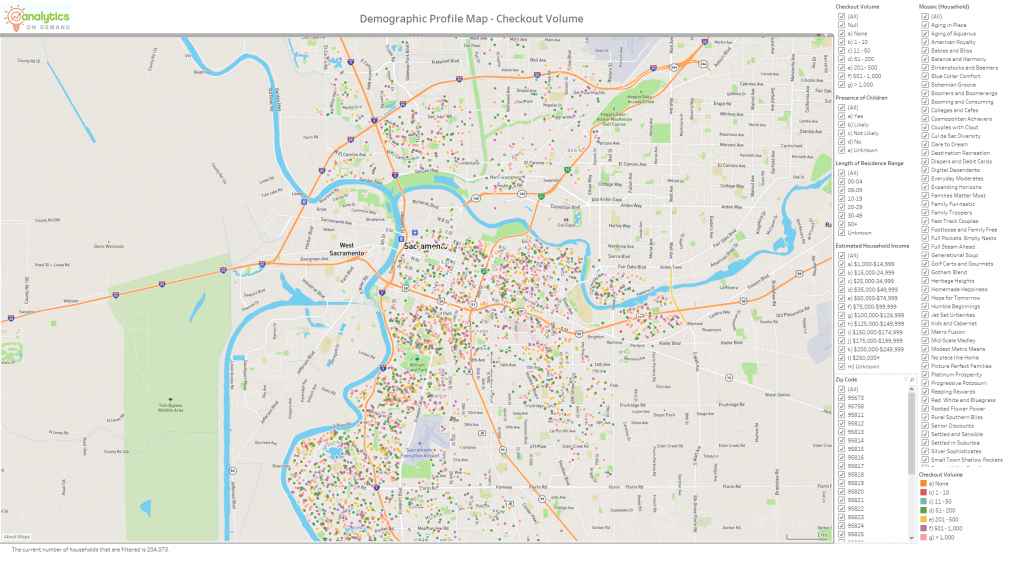
You’ll find the same interactive reports available through Power BI, but Tableau allows users to more easily make relationships between households and their surrounding area. Schools, parks, and well-known establishments are highlighted on the maps. Zoom in, out, around, and dig into your data like never before!
Take a peek!
For current Analytics On Demand users, the dashboard creator can be found in the gallery labeled “Dashboard Output Creator”. Your Gale Customer Success team member would be more than happy to set up a quick meeting to discuss the data upload/output process. Contact at Gale Customer Success via email or 800.877.4253.
Not an Analytics On Demand customer, but want to know more about the dashboard? Request a demonstration!AIR MAX PLUS

