Gale Analytics: Tip of the Month
| By Lisa Novohatski, Analytics Consultant |
Gale Analytics: Community Insights displays data on several tabs, visualizing data in different ways. First, we have the patron measures tab giving important information on demographics and the Experian Mosaic segments that are most prominent in the service area and patron base. The Patron Measures tab is followed by a number of maps.
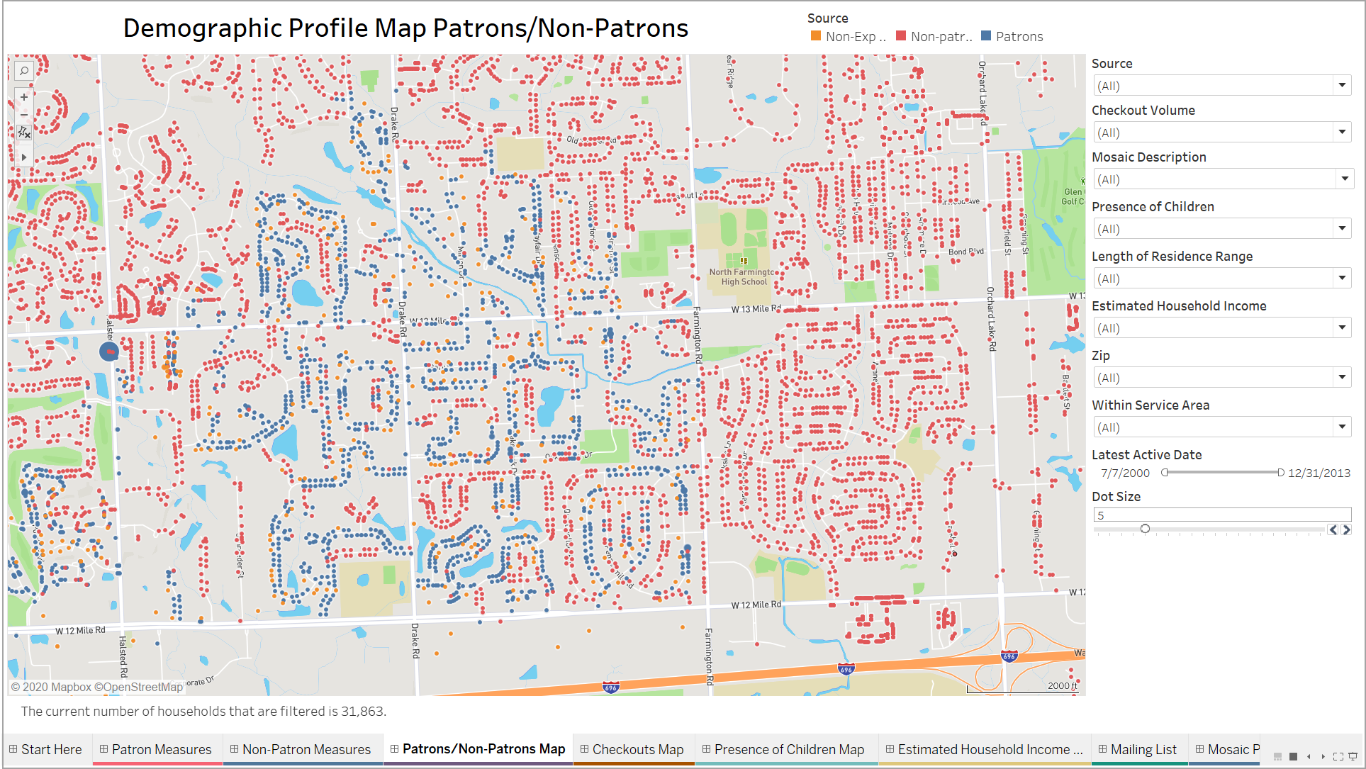
The first map is the Patrons/Non-patrons map. This map shows the full service area, with all households categorized as either patrons, non-patrons, or non-Experian patrons. Non-Experian patrons are patrons for whom we do not have the additional information from the Experian Mosaic Segmentation model. For the purposes of visualization, however, we keep them in the maps to give you a more comprehensive picture of where patrons are located within the service area.
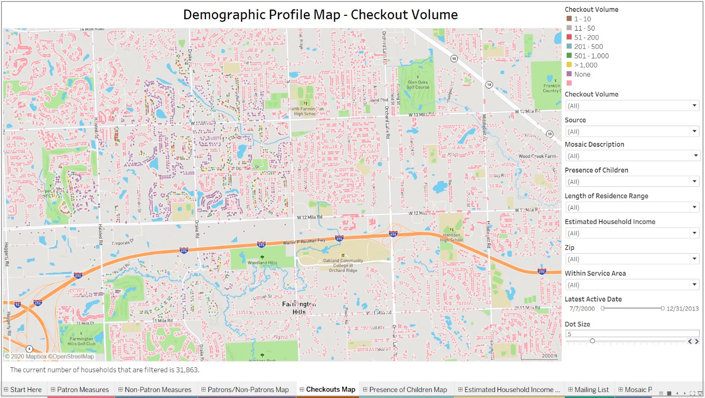
The next map is the checkouts map. This map takes the same data but visualizes it slightly differently, color coding households based on the checkout volume associated with each household. You’ll notice that non-patrons are still represented in this map, but they have a checkout volume of ‘N/A’.
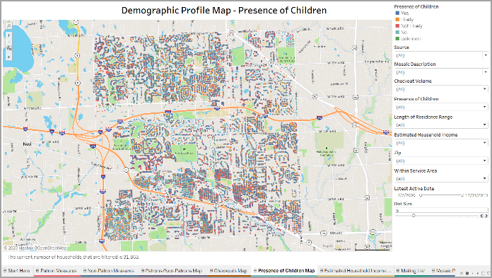
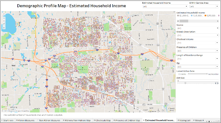
The final two maps visualize the same data but are color coded by demographic groups- by presence of children category and by estimated household income bracket, respectively. These two maps require viewing the data through a slightly different lens, as there is no visual distinction between patrons and non-patrons. You are still able to isolate patrons and non-patrons using the built in filters, but as Gale Analytics provides demographic information for both patrons and non-patrons, these two maps are really giving you a view of the full service area without visually distinguishing between patrons and non-patrons.
Though each map visualizes the same service area containing the same households, each map can tell a very different story and provide different insights. The patrons/non-patrons map allows you to clearly see where there are clusters of patrons and non-patrons within the service area. The checkouts map can highlight areas where there are high concentrations of patrons with no checkouts or, on the other end of the spectrum, power users. The final two maps give you the ability to visualize households based on demographic characteristics.
Let’s say you wanted to better understand where patron households with confirmed presence of children across the income spectrum are located within your service area. You could use the estimated household income map to isolate patron households which have the confirmed presence of a child. The map would then give you only patron households with confirmed presence of a child color coded by estimated household income. This would allow you to see where households with children of different income brackets cluster within the service area.
That’s all for now! Please reach out to me if you have any questions about the benefits of Gale Analytics or how other libraries are leveraging their data to gain insight about their community.
Calzado Nike